You can create some beautiful content by using some simple HTML elements. The Warp theme framework offers some neat styles for all HTML elements and a great set of CSS classes to style your content. Basic HTML is very easy to learn and this small guide shows you how to use all styles provided by the Warp framework.
Basic HTML Elements
Here is a short demonstration of text-level semanticts. The <p> element creates a new paragraph. It will have some space before and after itself. To turn your text into hypertext just use the <a> element.
Text-Level Semantics
You can emphasize text using the <em> element or to imply any extra importance the <strong> element. Highlight text with no semantic meaning using the <mark> element. Markup document changes like inserted or deleted text with the <del> element or <ins> element. To define an abbreviation use the <abbr> element and to define a definition term use the <dfn> element.
Short List with Links
Quotations and Code
Inline quotations can be defined by using the <q> element
.
The <blockquote> element defines a long quotation which also creates a new block by inserting white space before and after the blockquote element.
To define a short inline computer code use the <code> element. For a larger code snippet use the <pre> element which defines preformatted text. It creates a new text block which preserves both spaces and line breaks.
pre { margin: 15px 0; padding: 10px; font-family: "Courier New", Courier, monospace; font-size: 12px; line-height: 18px; white-space: pre-wrap; }
Use the <small> element for side comments and small print.
Useful CSS Classes
Here is a short demonstration of all style related CSS classes provided by the Warp framework.
Highlight Content
Drop caps are the first letter of a paragraph which are displayed bigger than the rest of the text. You can create a drop cap using the CSS class dropcap. To emphasize text with some small boxes use <em> element with the CSS class box.
This simple box is intended to group large parts of your content using the CSS class box-content.
This is a simple box to highlight some text using the CSS class box-note.
This is a simple box with useful information using the CSS class box-info.
This is a simple box with important notes and warnings using the CSS class box-warning.
This is a simple box with additional hints using the CSS class box-hint.
This is a simple box with download information using the CSS class box-download.
Use the CSS class dotted to create a dotted horizontal rule.
Tables
Create a zebra stripped table using using the CSS class zebra.
Table caption
| Table Heading |
Table Heading |
Table Heading |
| Table Footer |
Table Footer |
Table Footer |
| Table Data |
Table Data |
Data Centered |
| Data Bold |
Table Data |
Data Centered |
| Table Data |
Table Data |
Data Centered |
Definition Lists
Create a nice looking definition list separated with a line by using the CSS class separator.
- Definition List
- A definition list is a list of terms and corresponding definitions. To create a definition list use the <dl> element in conjunction with <dt> to define the definition term and <dd> to define the definition description.
- Definition Term
- This is a definition description.
- Definition Term
- This is a definition description.
- This is another definition description.
Forms
Create a clearly arranged form layout with fieldset boxes using the CSS class box.






Lightbox
June 8, 2011 by urjnetworkadmin • Uncategorised
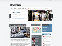
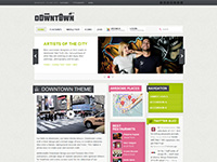
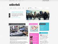
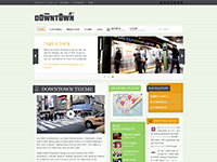
The Widgetkit Lightbox allows you to view images, HTML and multi-media content on a dark dimmed overlay without having to leave the current page.
Features
Examples
Different animations –
fade,elasticandnoneDifferent title positions –
float,insideandoverVarious examples in one gallery (try also using the keyboard and mouse scroll wheel)
How To Use
Use the HTML5 custom data attribute
data-lightboxto activate the lightbox. You can set various lightbox parameters to the data attribute. For example:Here is a list of the most common parameters:
float,outside,insideorover)fade,elastic, ornone)fade,elastic, ornone)trueorfalse